- Mon 20 October 2025
- thoughts
- Michiel Scholten
- Nerdcave
- #design, #energy, #fonts, #opensource, #tech
I like to tinker with user interfaces and especially typefaces (fonts) have fascinated me for a long time. Not long ago, I rolled out Literata on this weblog and a lot of other places where I read long-form texts (wait, it has been over a year already?!). Late 2023 I was pleasantly surprised by the Monaspace families for all things monospace (even the running texts of this weblog which I since changed to Literata). Having a nice monospace font is great for when you use text editors and - very importantly - terminal windows.
As a native inhabitant of terminal windows, I love me a good monospace. Before switching to Monaspace Neon late 2023, I had been using Hack for almost a decade - clean, readable and available in a Nerd Fonts version after the first year or so. Monaspace Neon had a slightly more playful look to it, and it shook things up in my terminal windows (with vim and a lot of other tools) in a non-disruptive but fun way. I quickly started using it everywhere that I needed a monospace typeface.
A few weeks ago I ran across the Lilex monospace font, which is derived from the already excellent IBM Plex Mono, but with some extra fancy stuff like ligatures (which I don't really use, but sure are pretty) and other tweaks to make it look even better. I downloaded it, tried it in my terminals and even though it has Powerline characters baked in already, I immediately downloaded the Nerd Font variant and set it as my new default.
This time though, it was because I adored its italics. Yes, the regular is great too, and has just the right amount of personality to make a difference, but the italic variant of Lilex is just so playful and neat.
I mean, look at the comments in this screenshot for example:
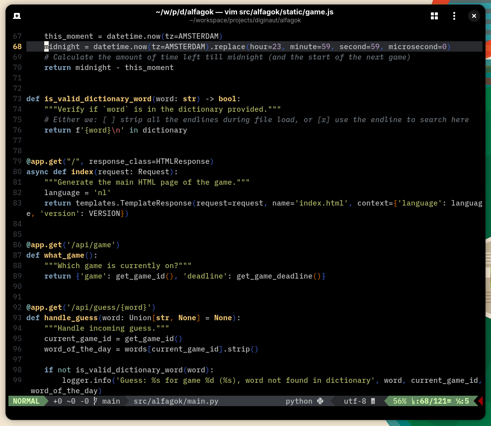 Lilex used in Ptyxis terminal with 'alfagok' opened inside vim
And in PyCharm it is used for some keywords too, which gives my code just a little extra:
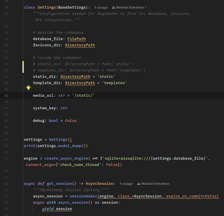 Lilex used in PyCharm with 'digimarks' setup
I cannot get enough of those slants and almost handwritten-like characters :)
Lilex also replaced Monaspice Neon on this weblog as the monospace font for not ony codeblocks, but also the navigation and the metadata texts; it immediately looked a bit cleaner and for some reason it vibes very well with Literata, so I am pretty pleased with this Li-Li duo.