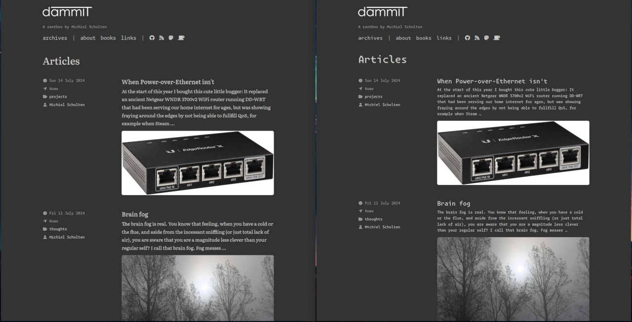
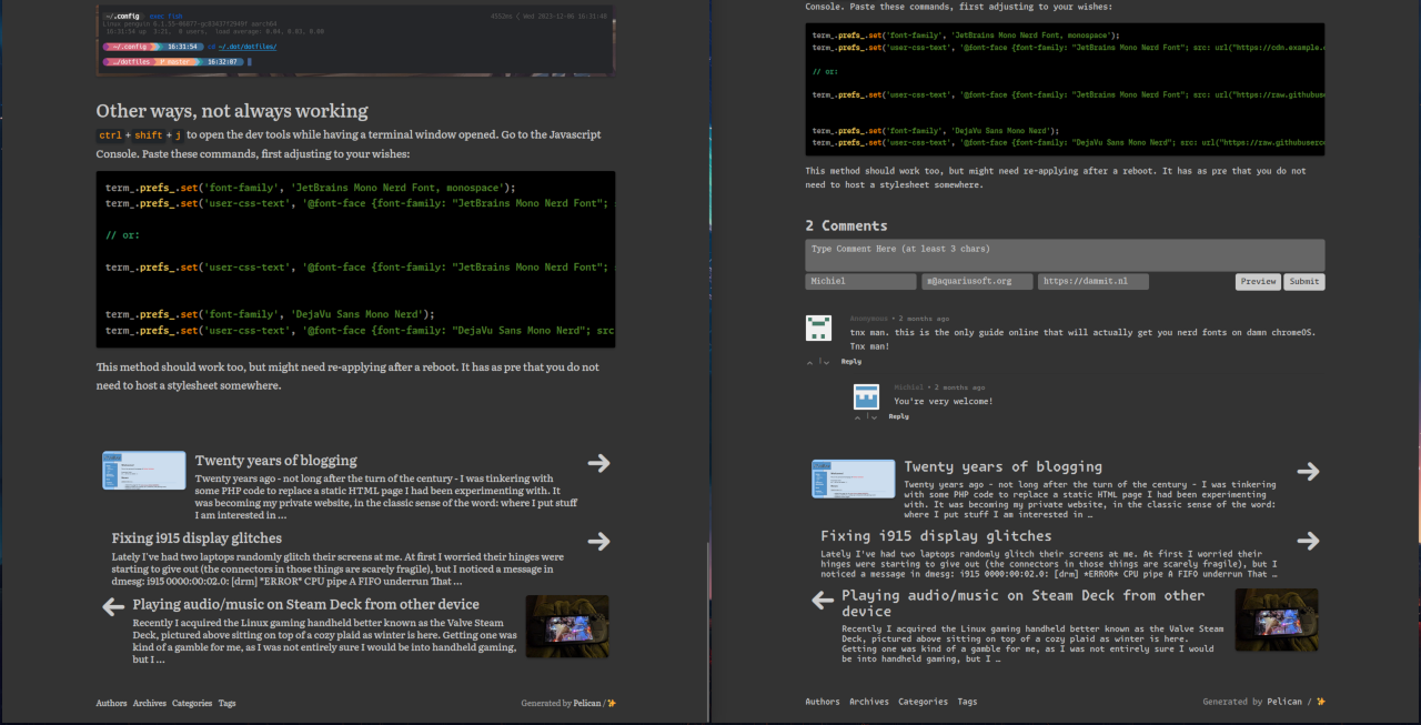
Lately I have been reading quite a bit, and while doing so I came across the Literata serif font. I really like its style and how well it reads in both regular and italics, and decided to play around with it on my weblog.
It escalated quickly, and now you can get a taste of those well-crafted glyphs right here.
This replaces almost all the Monaspace fonts introduced late last year, except for Argon which is still used for some metadata fields and the menu at the top of the page, because I like it that way.
Let me know what you think, or where you see something going wrong in the styling.
On the right, the 'before' with various Monaspace fonts:


